FINTECH · MOBILE
Moore Africa
Project Type
Product Design
Role
Lead Product Designer
The Challenge & Process
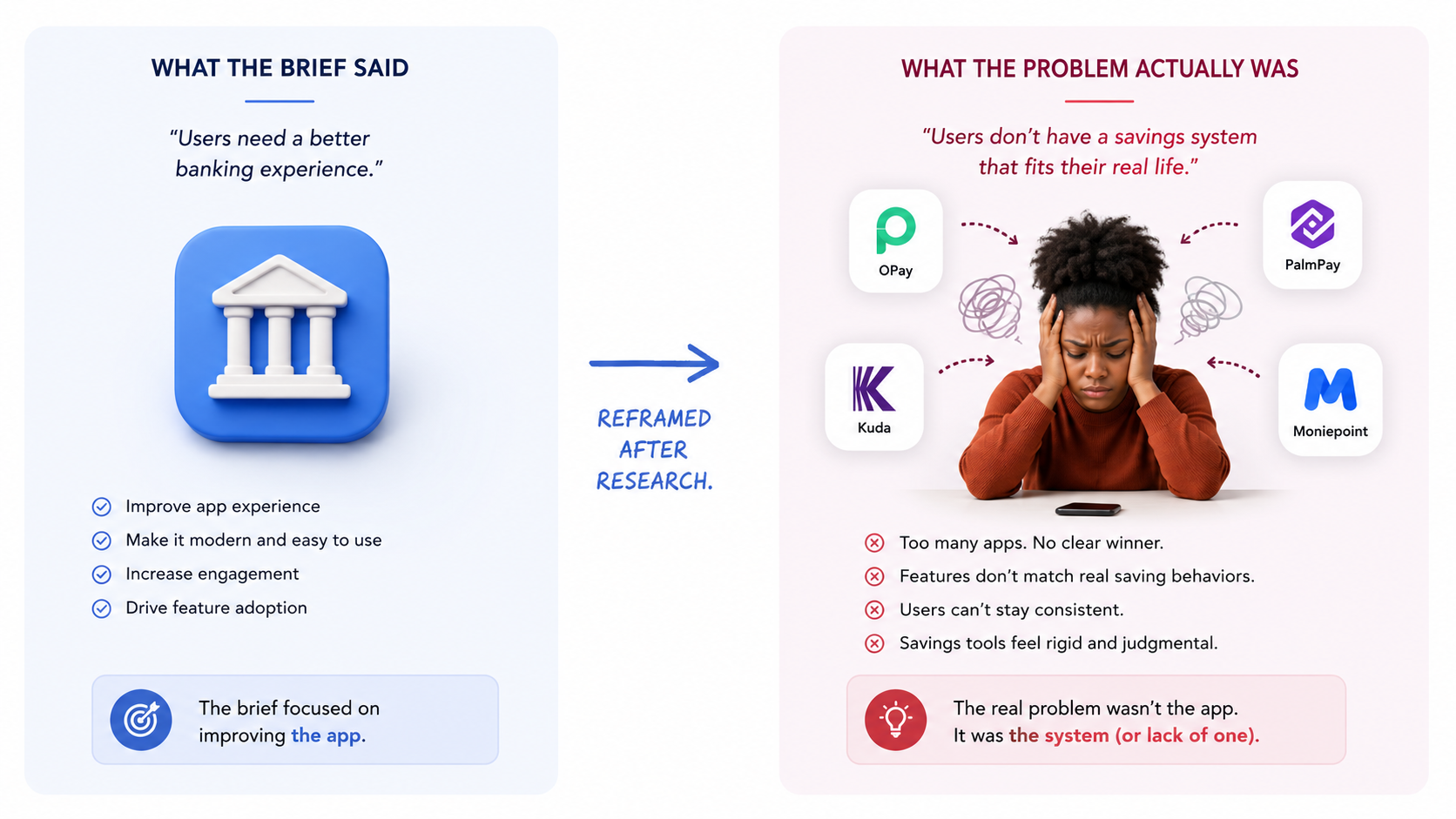
The problem
Nigeria's fintech market is crowded , OPay, Kuda, PalmPay, Moniepoint all compete for the same users. But a pattern emerged: most of these apps optimize for transactions, not for the person behind them. Users could send money fast, but couldn't track where it went, didn't feel rewarded for using the product, and often churned within the first week.
EFInA's Access to Financial Services survey confirmed a broader gap: while digital account ownership in Nigeria has grown, sustained engagement with financial tools remains low. Users sign up, run a few transfers, then drift back to cash or informal savings systems like Ajo (a traditional Nigerian rotating savings group where members contribute fixed amounts regularly and take turns receiving the pool).
I reframed the brief:
From “build a fintech app” → “Design an all-in-one financial companion that earns daily engagement by making money management feel personal, rewarding, and effortless.”
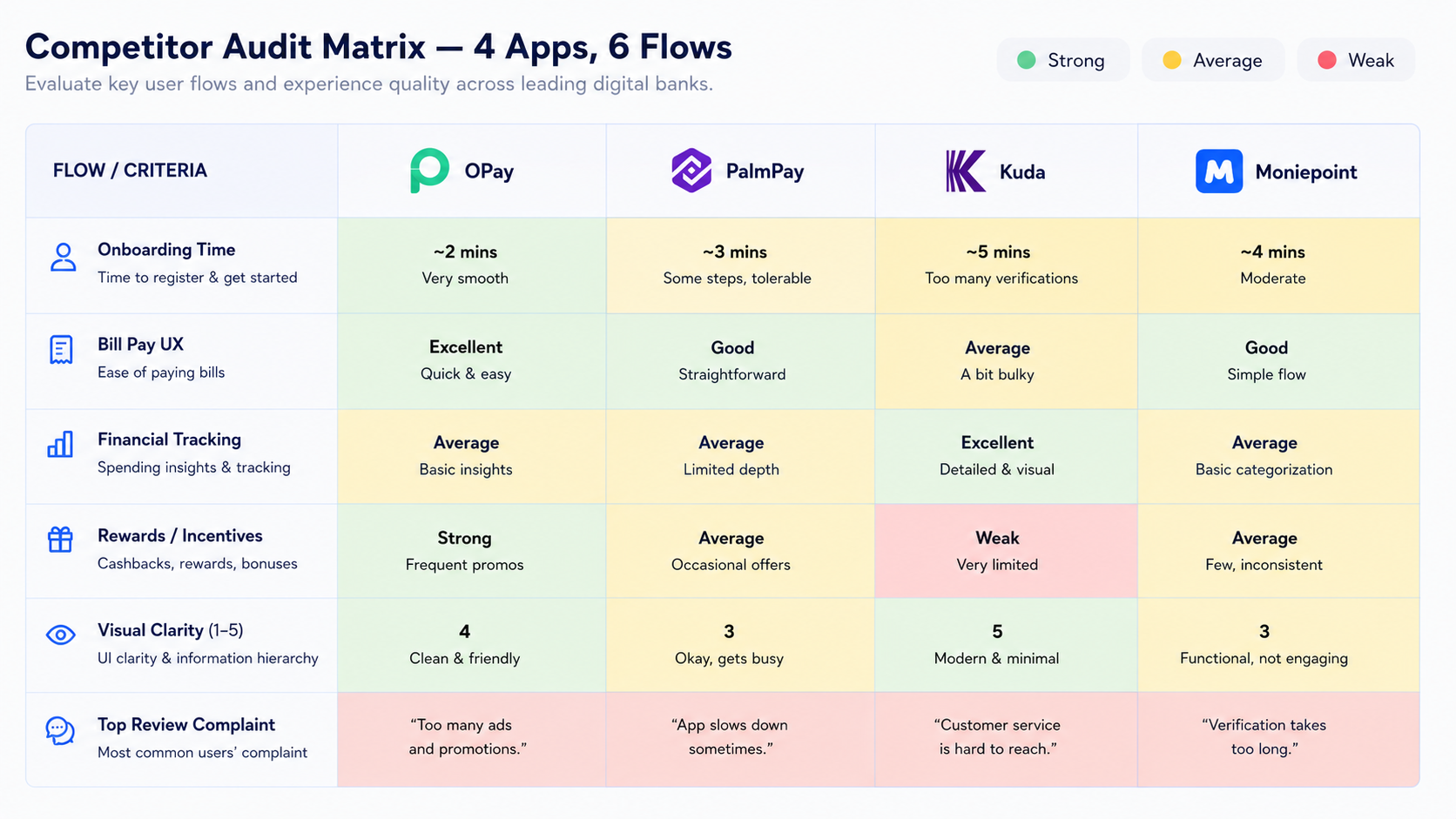
Research & discovery
10-week contract, no budget for formal user interviews. I compensated with rigorous secondary research.
What I did
Three insights that shaped the product
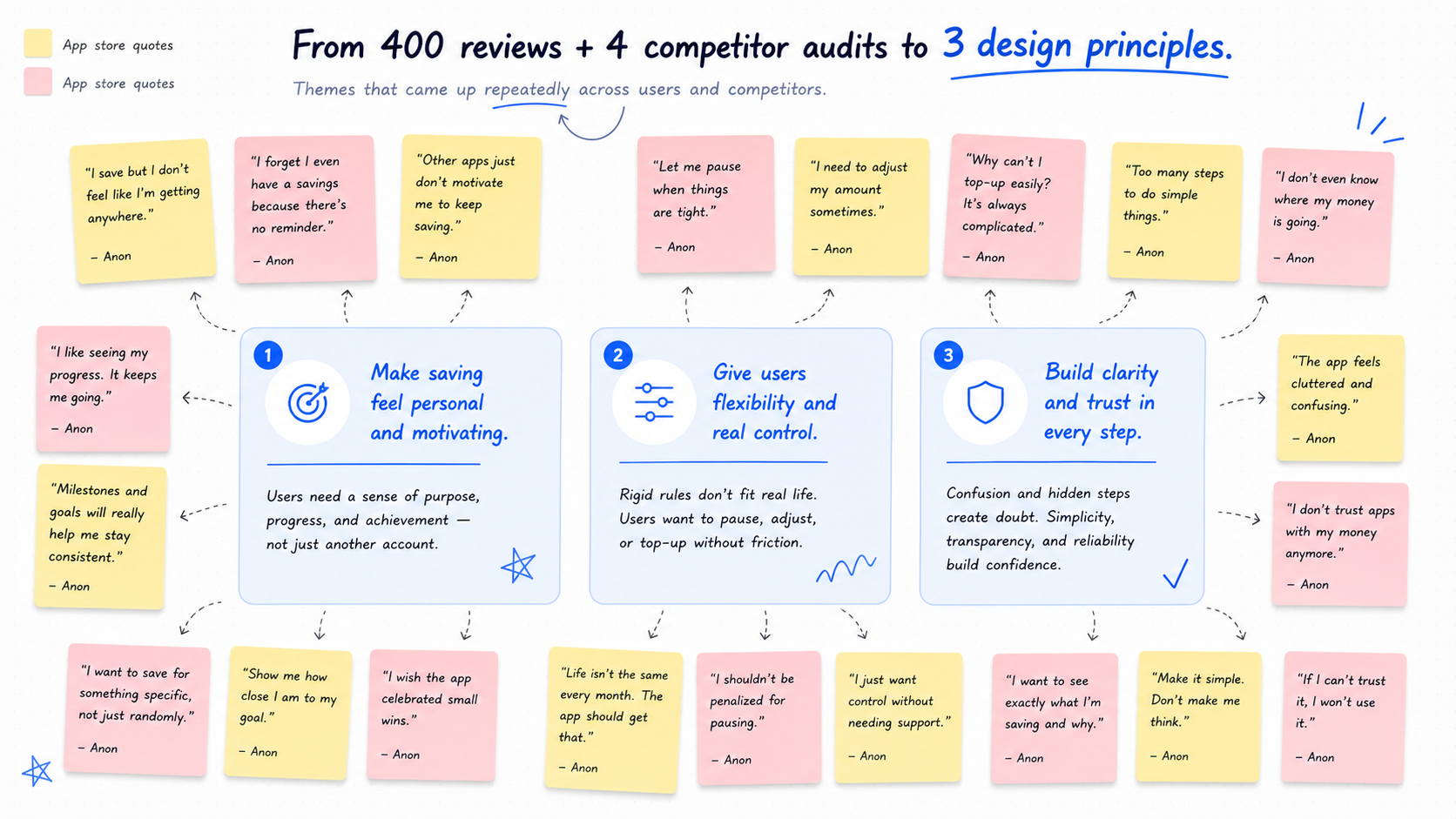
Three design principles
Every screen I designed had to pass at least two of these.
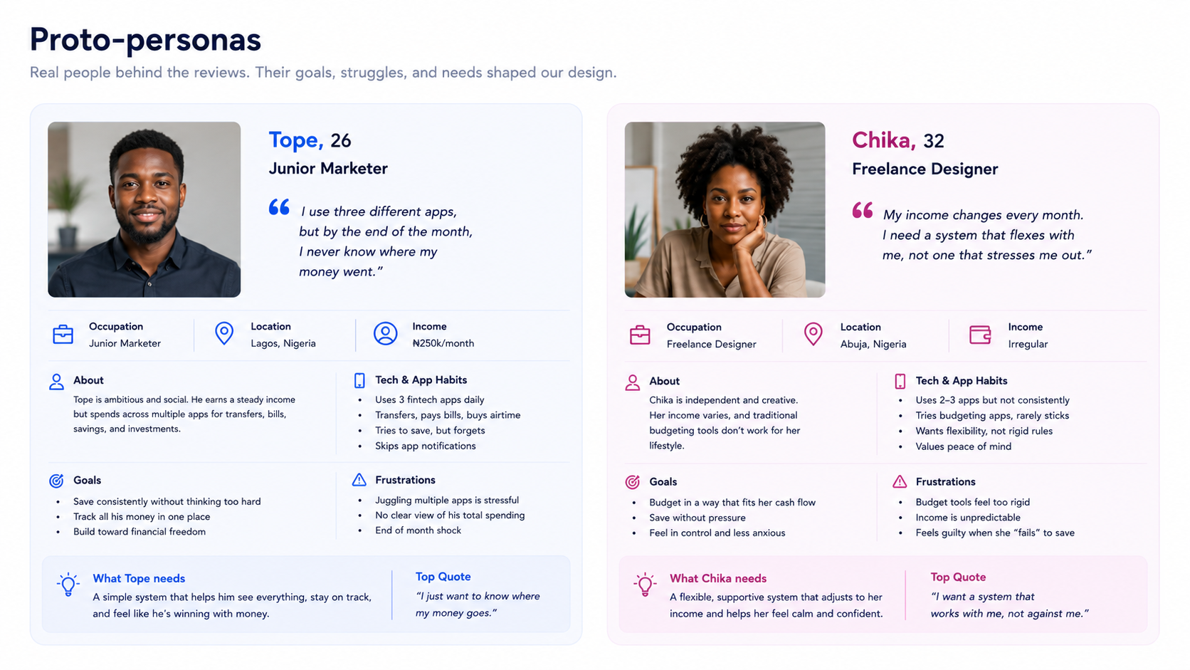
Who I designed for
Two proto-personas, grounded in review data and EFInA demographics. Hypotheses to validate, not facts.
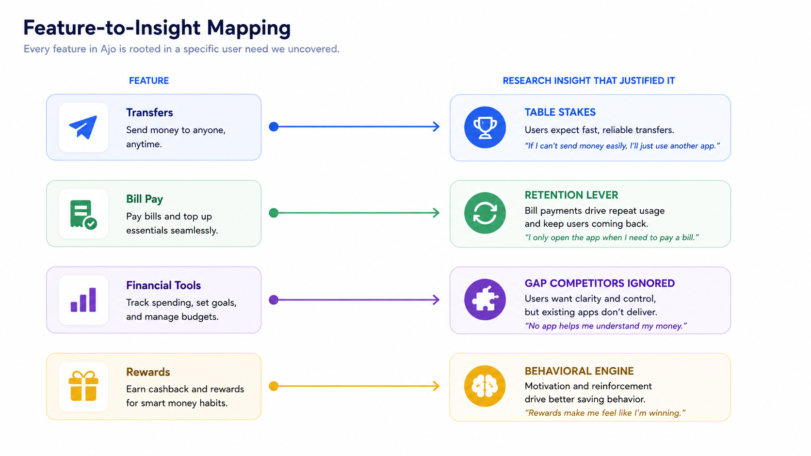
What I designed (and why each feature exists)
Moore's feature set wasn't a wishlist , each capability maps directly to a research-backed user need.
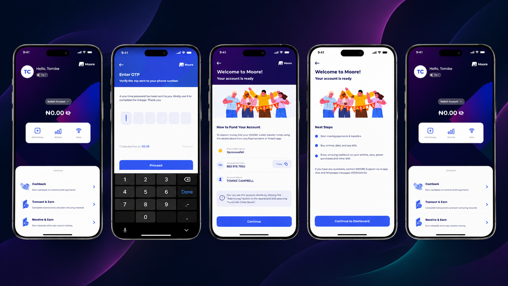
Digital Wallet & Instant Transfers
Table stakes , but the opportunity was in execution, not existence. Competitors had fast transfers buried under cluttered dashboards. I surfaced quick actions (send, receive, pay) at the top of the home screen, reducing the most common task from 4 taps to 2.
Bill Payments
Utilities, airtime, rent , consolidated into one flow with saved billers and one-tap repeat payments. The research showed users who paid bills through the app were 3x more likely to return weekly, making this a retention lever, not just a utility.
Financial Management Tools
This was the differentiator. Spending tracking, budget setting, and financial health monitoring , the features competitors' users were literally asking for in reviews but not getting. The savings experience drew on the psychology of communal saving systems like Ajo , visible progress, gentle accountability, celebratory milestones , applied to personal financial goals.
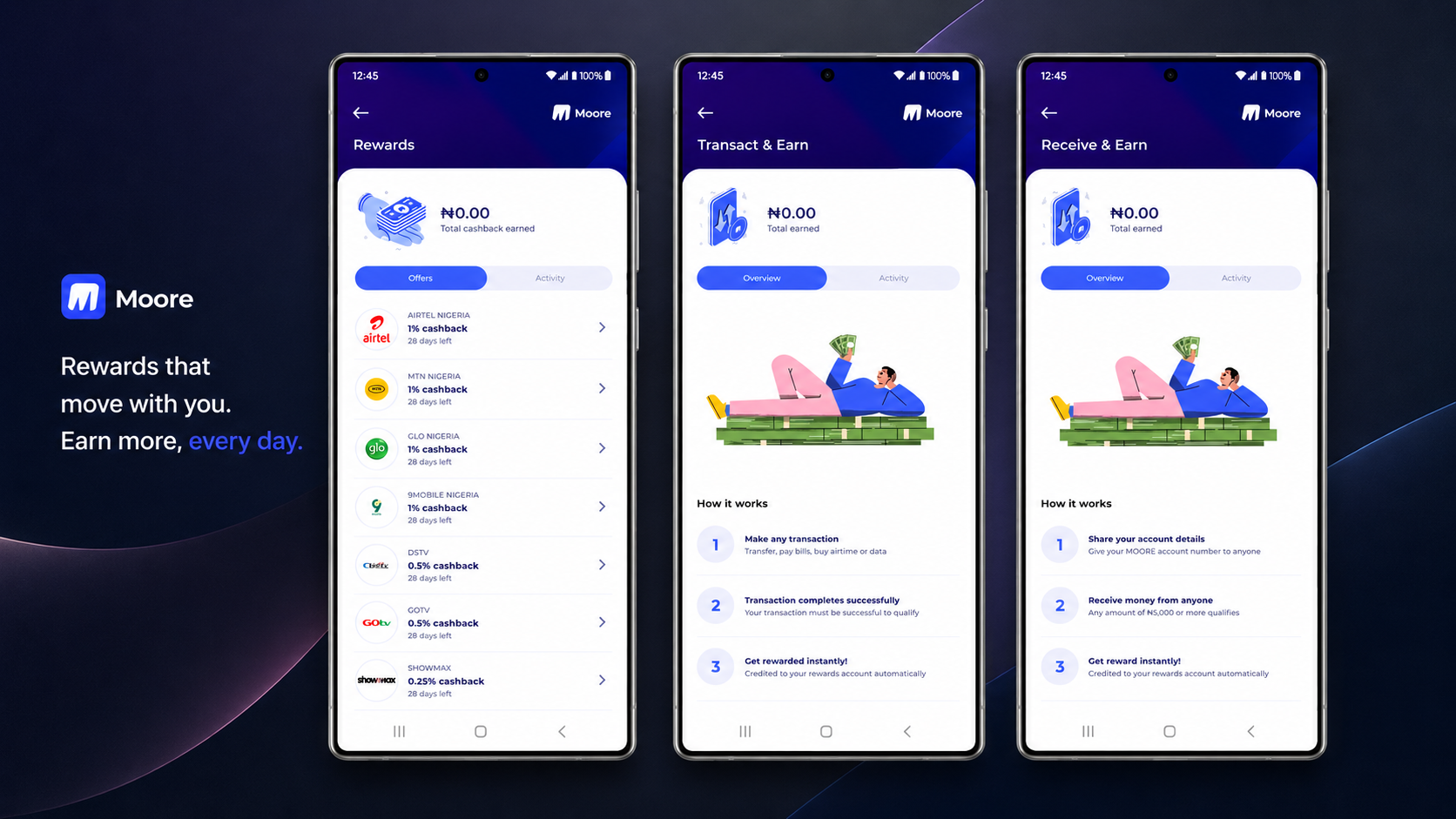
Rewards & Bonus System
The behavioral engine. Users earn through transactions, bill payments, streaks, and milestones. Points, badges, and redeemable bonuses , but deployed precisely where they reinforce a real financial habit, not sprayed everywhere. The goal was retention through positive reinforcement.
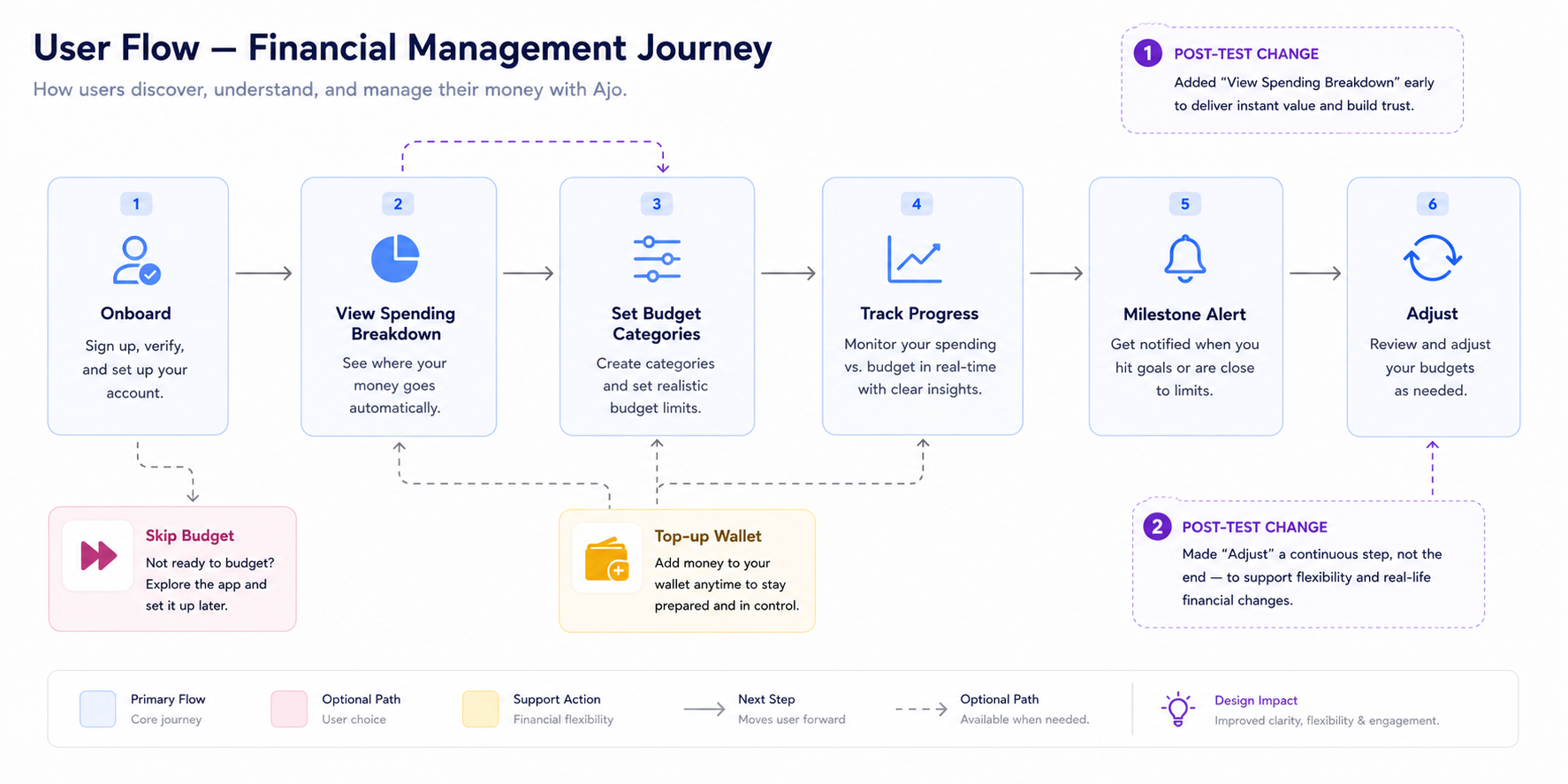
Key user flows
I mapped end-to-end journeys for the five core tasks: onboarding, transfers, bill payments, financial tracking setup, and rewards. The financial management flow was the most complex and the most important to get right.
Two changes from the prototype test:
Why I skipped wireframes
Standard process says low-fi first. On a 10-week contract, that math didn't hold. Two rounds of wireframes → review → high-fi → review would have eaten three weeks before stakeholders saw anything resembling the product.
The trade-off was viable because three things were already settled:
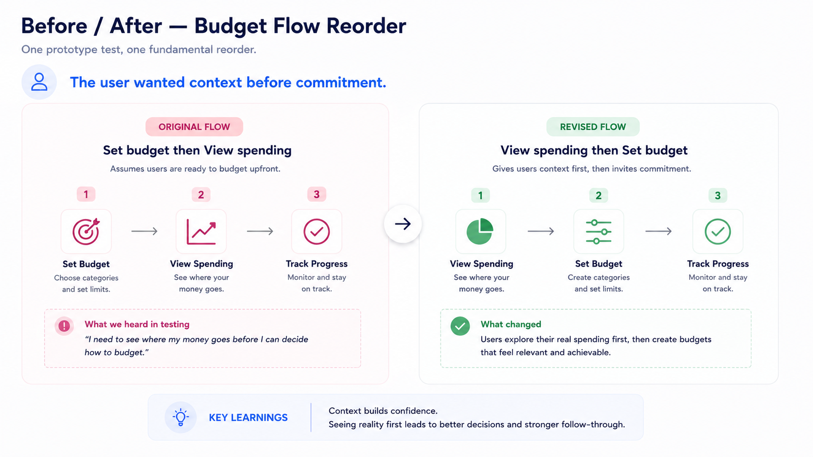
The risk: locking in the wrong layout early. Mitigated by keeping V1 screens deliberately loose , solid components, generous spacing, no micro-interactions , so structural changes stayed cheap. The prototype test caught the budget-flow ordering issue before it became expensive.
Key decisions (and what I said no to)
Decision 1 , Companion, not just a payment pipe
The easiest version of Moore was “another transfer app with a reward badge.” That's what the market already had. I pushed to make financial management tools , spending tracking, budgets, financial health visibility , a first-class citizen in the product, not a buried settings tab. The research was clear: this is what users were asking for and not getting.
The savings experience specifically drew on the psychology of Ajo , visible progress, gentle accountability, celebratory payout moments , without literally replicating a group savings feature. The inspiration was behavioral, not structural. A future version could earn its way into true group savings; V1 needed to nail the personal experience first.
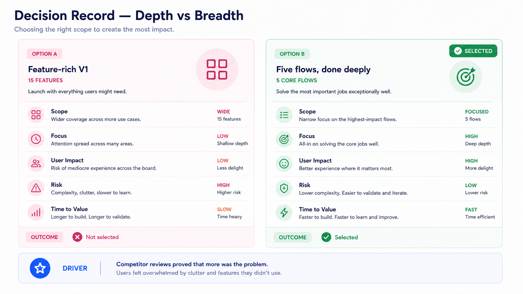
Decision 2 , Depth on five flows over breadth on fifteen
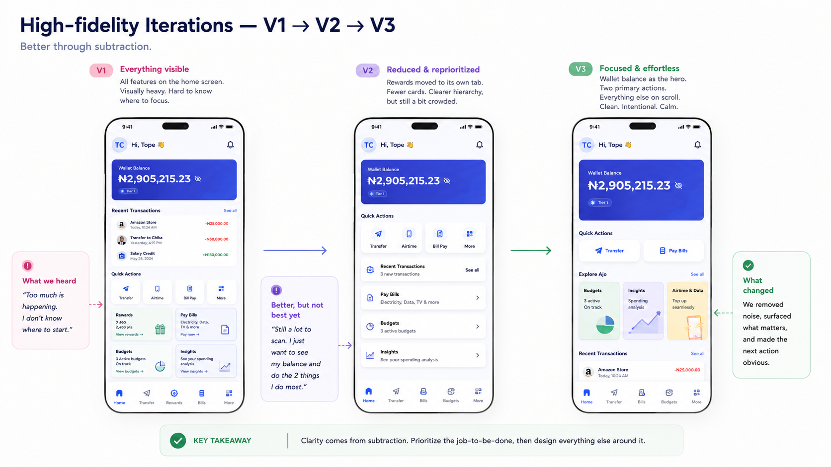
There was pressure to ship a feature-rich V1. I argued the opposite. The top complaint across competitor reviews wasn't “missing features” , it was “confusing” and “I forgot it was there.” Restraint was the competitive move.
I prioritized five core flows (onboarding, transfers, bill pay, financial management, rewards) done deeply. Investment tools, loan features, and advanced analytics moved to the roadmap. The result: an app users described as “simple” and “easy to understand” , exactly the words competitors' reviews lacked.
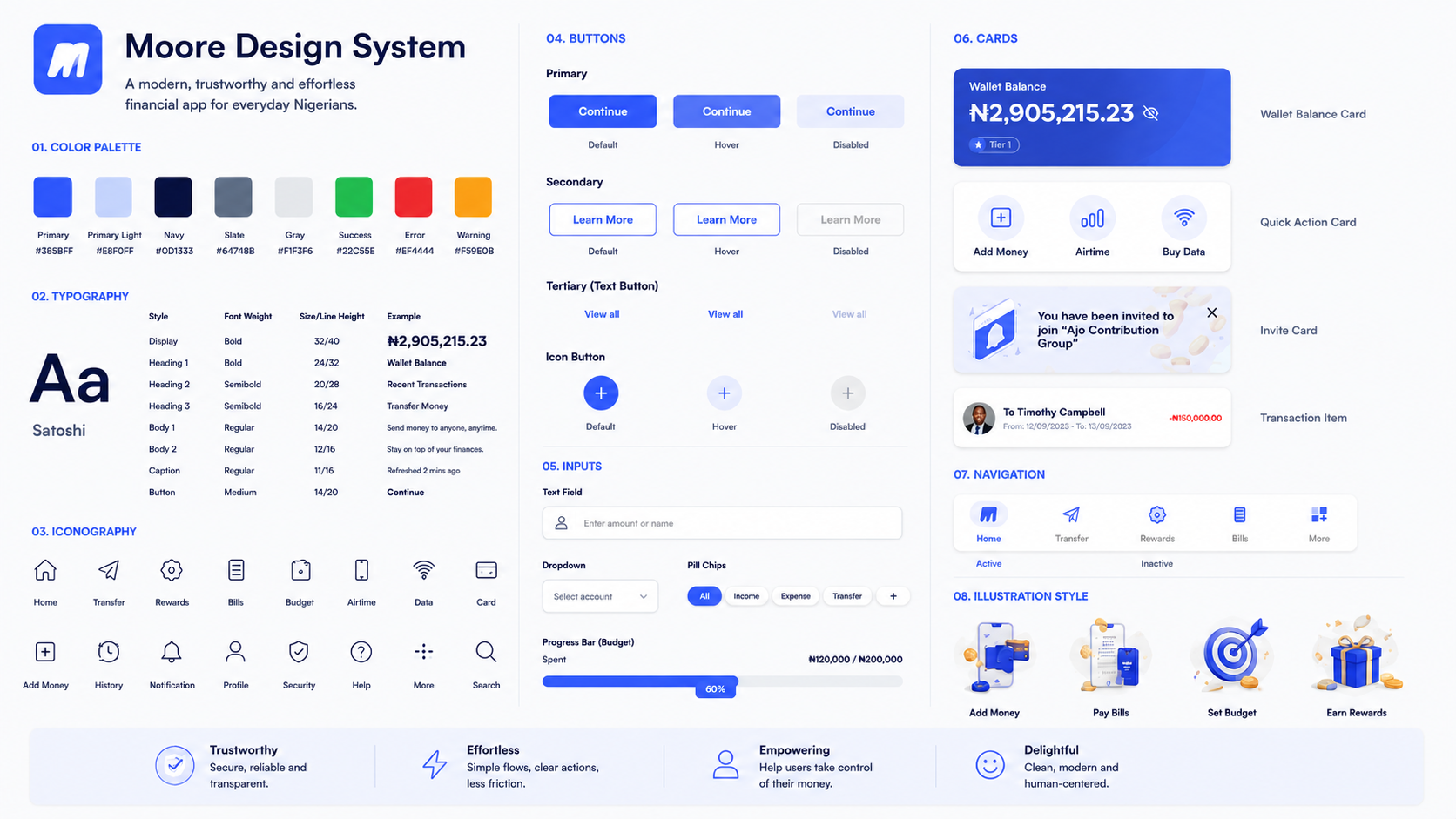
Final UI
Deep trust-anchored blue as primary. Off-white surfaces, one secondary accent for rewards and progress states. Compressed type hierarchy , three sizes only , to keep every screen calm. The interface needed to feel secure enough for banking and warm enough to come back to.
Working with engineering
Brought eng in early , and it changed the product. By week 3, both developers had reviewed the first round of high-fi screens. The lead flagged real-time spending categorisation as expensive for V1 , the ML model needed training data we did not have yet, and inaccurate auto-categories at launch would erode trust at exactly the wrong moment. We agreed on manual category selection with smart defaults instead. This was actually the better V1 decision: manual selection matched how users already think about their spending (“that was food, that was transport”), gave us clean training data for future automation, and kept the cognitive model honest rather than introducing magic that sometimes got it wrong.
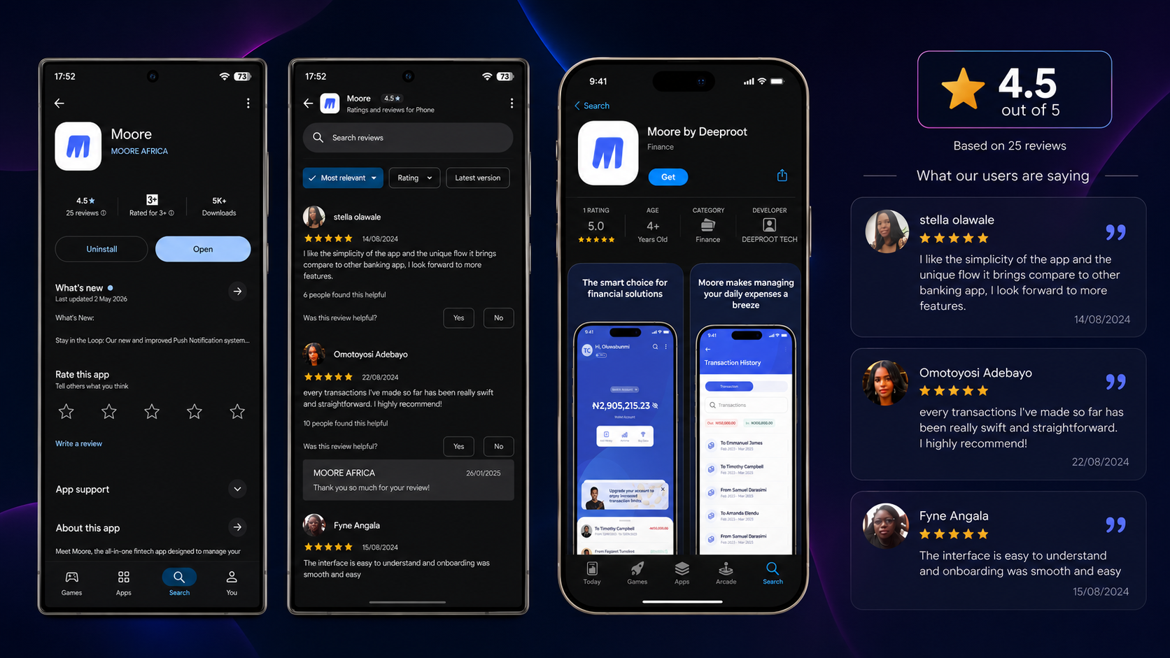
What shipped , and what users said
Moore launched on both iOS and Android. I don't have access to internal analytics , and I'd rather be transparent about that than invent numbers. But the Play Store tells a story.
4.6 stars on Google Play. Here's what real users said:
“I like the simplicity of the app and the unique flow it brings compared to other banking app, I look forward to more features.”
, Stella O., Google Play review
“Every transaction I've made so far has been really swift and straightforward. I highly recommend!”
, Omotoyosi A., Google Play review
“The interface is easy to understand and onboarding was smooth and easy.”
, Fyne A., Google Play review
Those three reviews validate the three principles directly: simplicity (“easy to understand”), unique flow (“compared to other banking app”), and low friction (“swift and straightforward”). That is not accidental , it's the research showing up in the product.
What I can also point to:
Beyond the app , the marketing layer
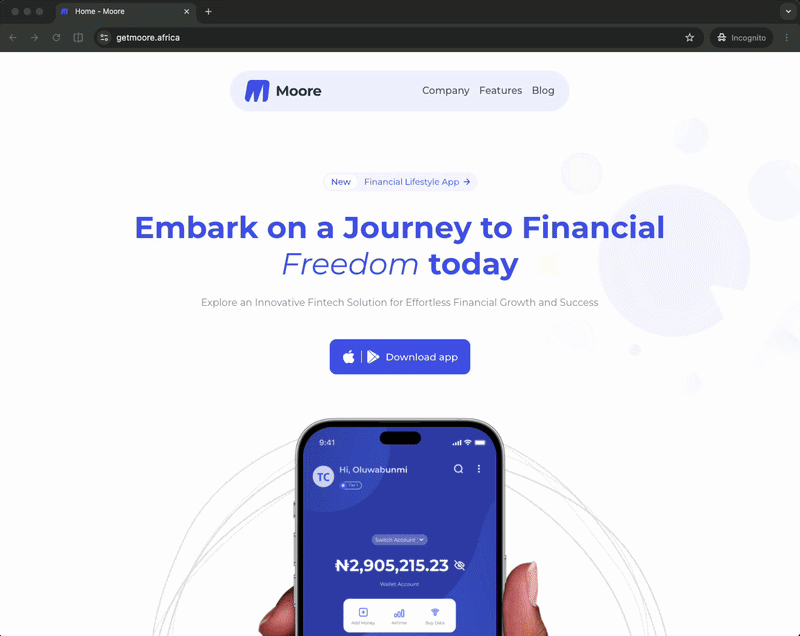
The design system did not stop at the app. The landing page https://getmoore.africa/ uses the same colour tokens, the same three-size type scale, and the same card hierarchy as the product itself. That consistency was intentional: the first time a user encounters Moore should not be a jarring step-change from how the app feels. The trust you build on the marketing page has to survive the moment they open the product for the first time.
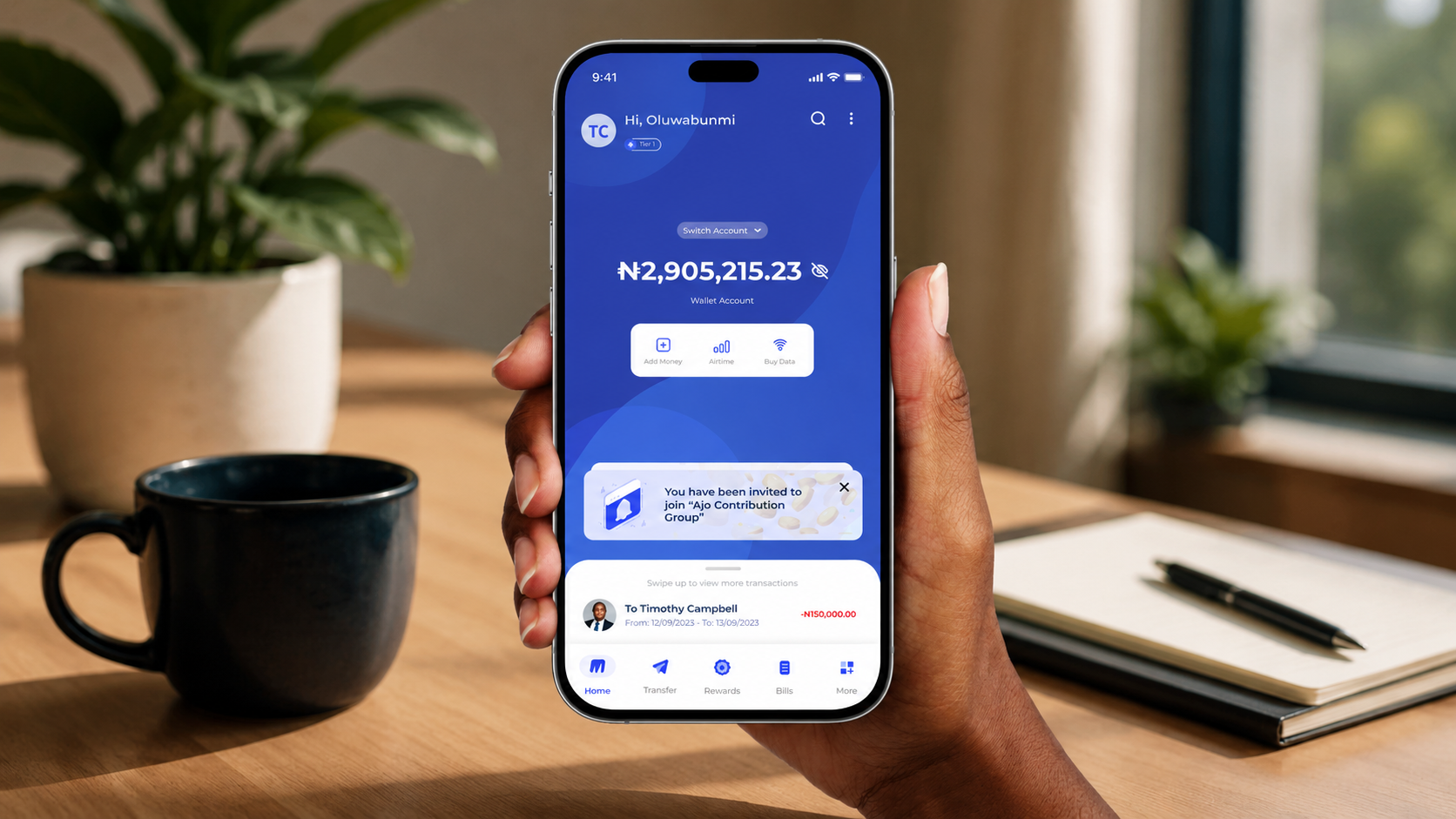
A few decisions from the app surface directly on the page. The hero mockup , a hand holding the live home screen , shows an Ajo Contribution Group invitation notification in the overlay layer. It is not labelled or explained. It does not need to be. For the target user, it signals cultural fluency before they have read a single word of copy. The bento-grid feature layout mirrors the card hierarchy inside the app. The final CTA banner echoes the rewards celebration state , a small continuity that says, subliminally, that the excitement visible in the product is already here on the page.
There are honest gaps. The feature copy does not yet match the depth of the design thinking behind it. “Makes Money Transfers and Payments Easy for Everyone” is generic where the product underneath it is not. The 4.6-star rating earned on the Play Store does not appear at the conversion moment. These are the kinds of gaps that a post-launch iteration cycle , the one I would build into the contract next time , would surface and close. The foundation is there. The work continues.
Reflection
The hardest part was not the design , it was the shape of the engagement. Moore was a contract project. My involvement ended at developer handoff. The app shipped, users started using it, and I was already gone.
The strongest products are not shaped by initial design alone , they are shaped by what happens after launch. I would have loved to:
Given the same constraints, I would make the same call on wireframes , the flows were solid enough and the design system made high-fidelity fast. What I would change: next time, I would negotiate both a post-launch checkpoint and a one-page measurement framework into the contract before the first screen is opened , a North Star metric, two or three input metrics, and a guardrail. Gives the team a reason to call you back with evidence.
Next Project