PUBLIC MEDIA · MOBILE
Radio Nigeria
Project Type
UX/UI Design
Role
Lead Product Designer
The Challenge & Process
The problem
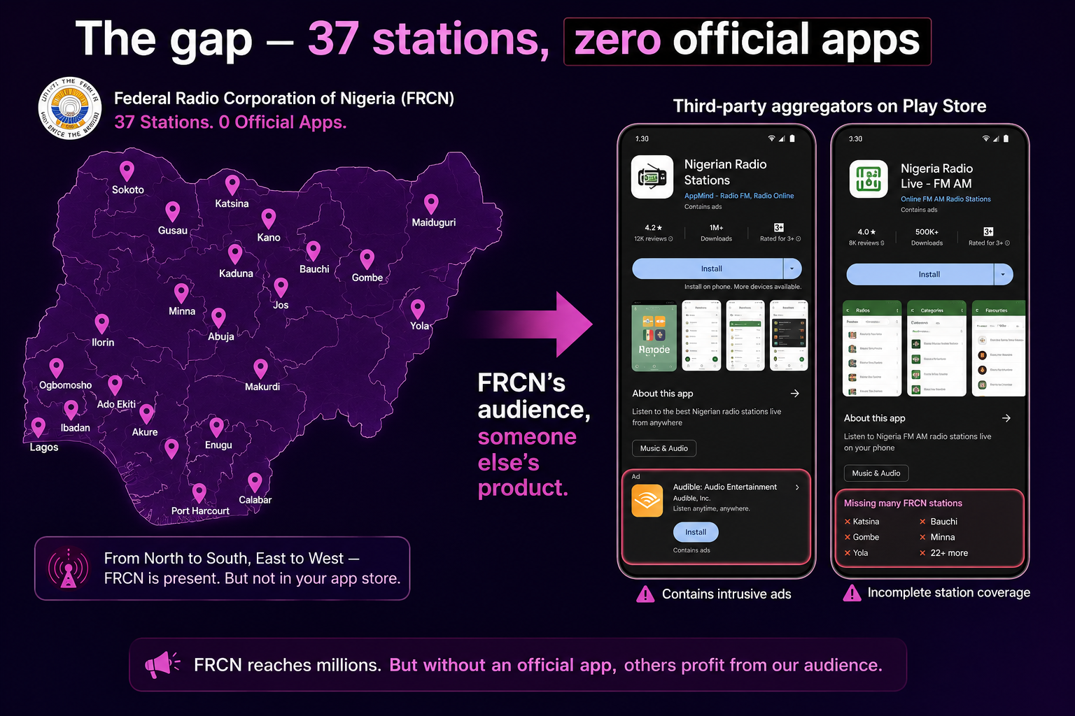
FRCN is Africa's largest radio network: 37 stations across all 36 states and the FCT, broadcasting in 15 languages to over 100 million listeners. It has been on air since 1933. And until this project, it had no official mobile app.
That vacuum was being filled by third-party aggregator apps. Ad-heavy, unreliable, with incomplete station lists and zero editorial control. FRCN's own audience was discovering the network through products the network did not own, could not control, and did not benefit from.
Meanwhile, the core audience (loyal listeners aged 40 and above who have tuned in for years) was shifting from transistor radios and car FM to smartphones. They needed a bridge. Not a flashy consumer app, but a reliable, simple, trustworthy digital extension of something they already loved.
I reframed the brief:
From "build FRCN a mobile app" → "Give decades-long listeners a digital front door to the radio they already trust, one that feels as reliable and familiar as turning the dial."
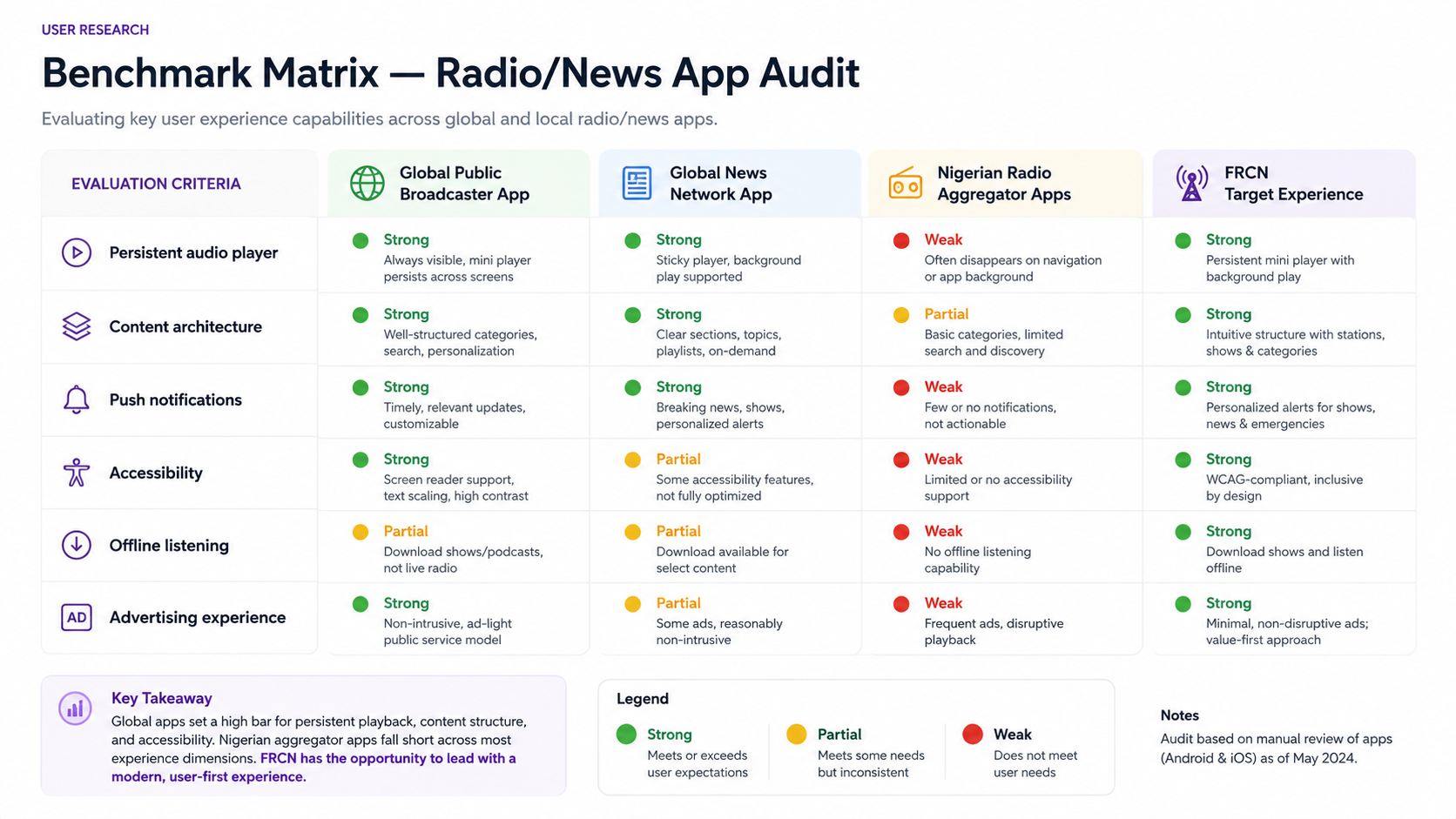
Research: benchmarking against the best
FRCN's leadership set the bar explicitly: they wanted an app that held up against BBC Sounds and CNN. Not in budget or feature count, but in quality of experience. That gave me a clear research mandate.
What I did
Three insights that shaped the product
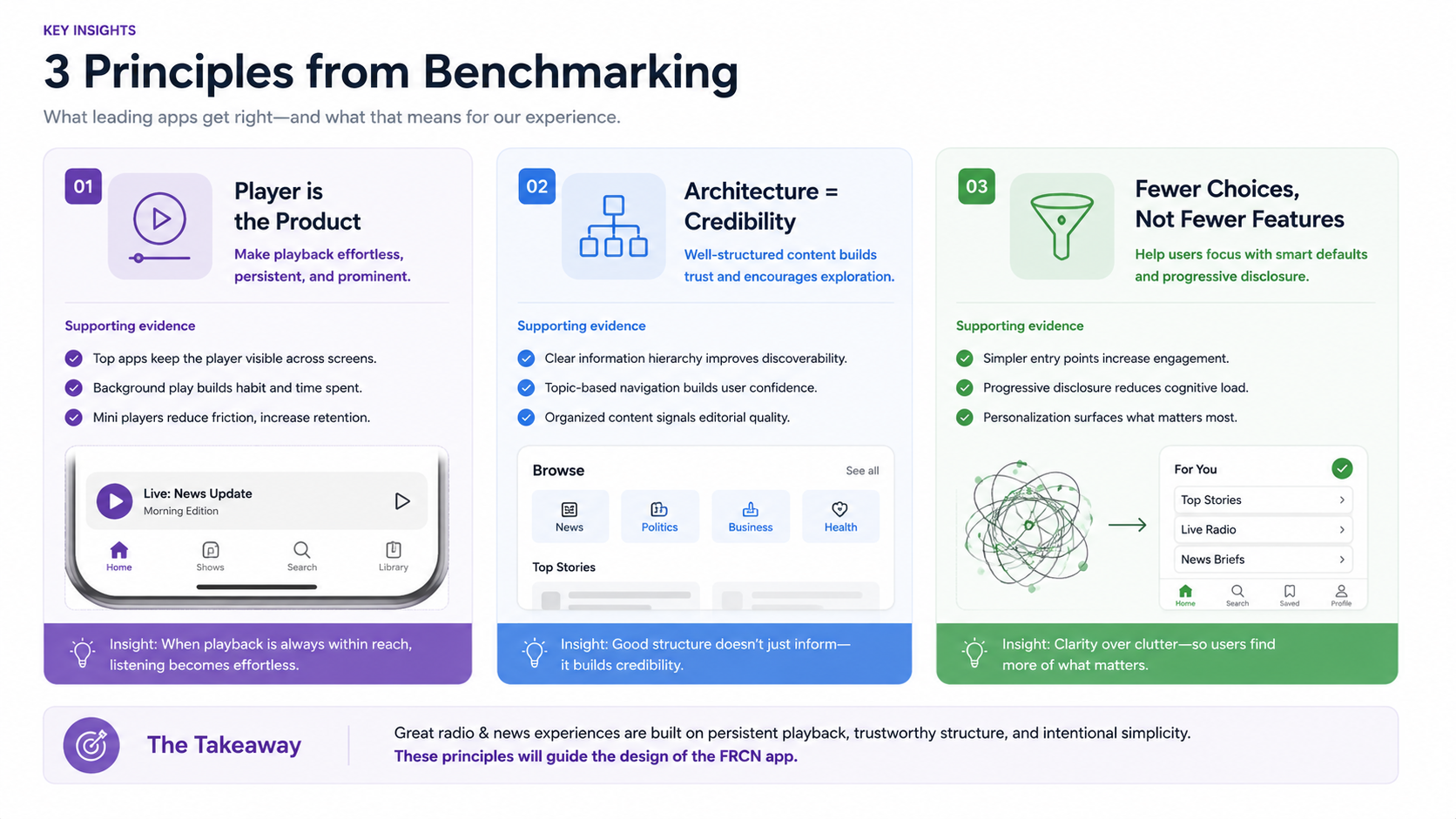
Three design principles
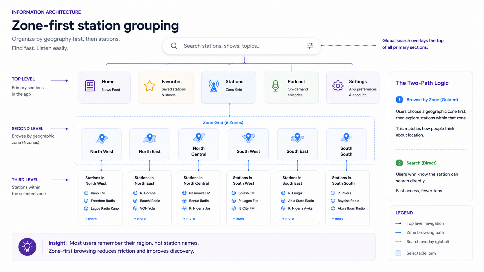
Content architecture: the hardest design problem
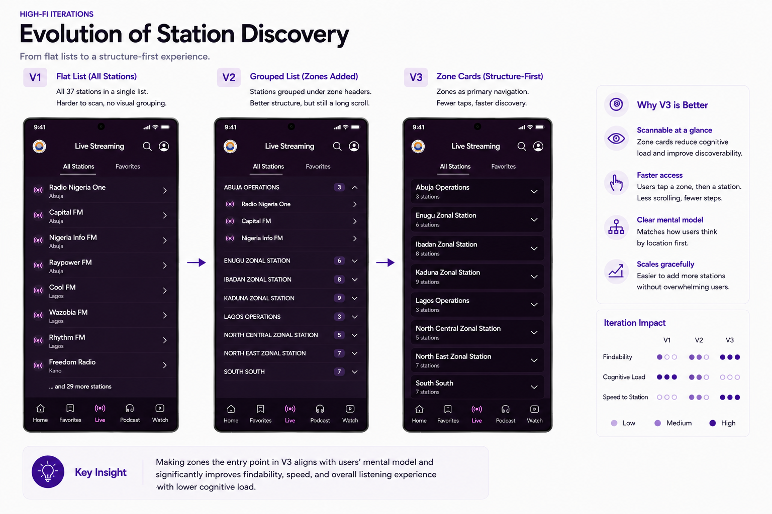
FRCN is not a single radio station. It is a network of 37 stations spread across 6 geopolitical zones, broadcasting in 15 languages, plus a national news operation. The architecture had to serve two mental models simultaneously: the listener who knows exactly which station they want, and the one who browses by region.
The zone-first structure
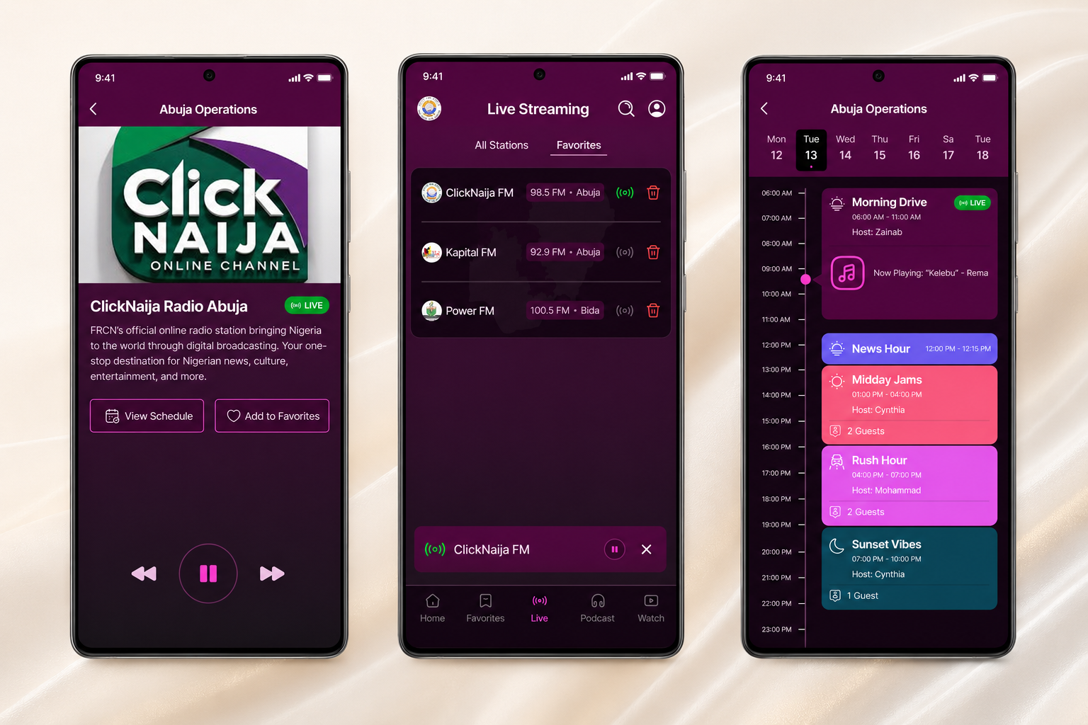
I grouped stations by geopolitical zone (South West, South East, South Central, North West, North East, North Central) because that is how Nigerians already think about regional identity and language. A listener in Enugu does not search an alphabetical list of 37 stations. They look for South East, find their station, and tune in. The architecture mirrors the mental model.
Search sits above the zone grid for the listener who already knows what they want. Two paths to the same destination: one for browsing, one for intent. Both arrive in one tap.
What I designed (and why each feature exists)
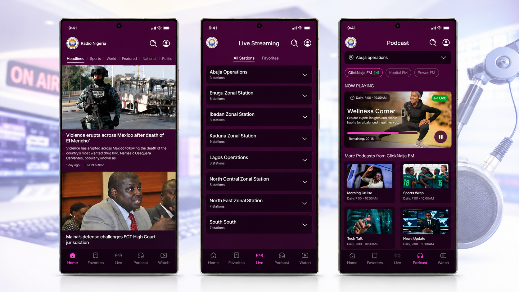
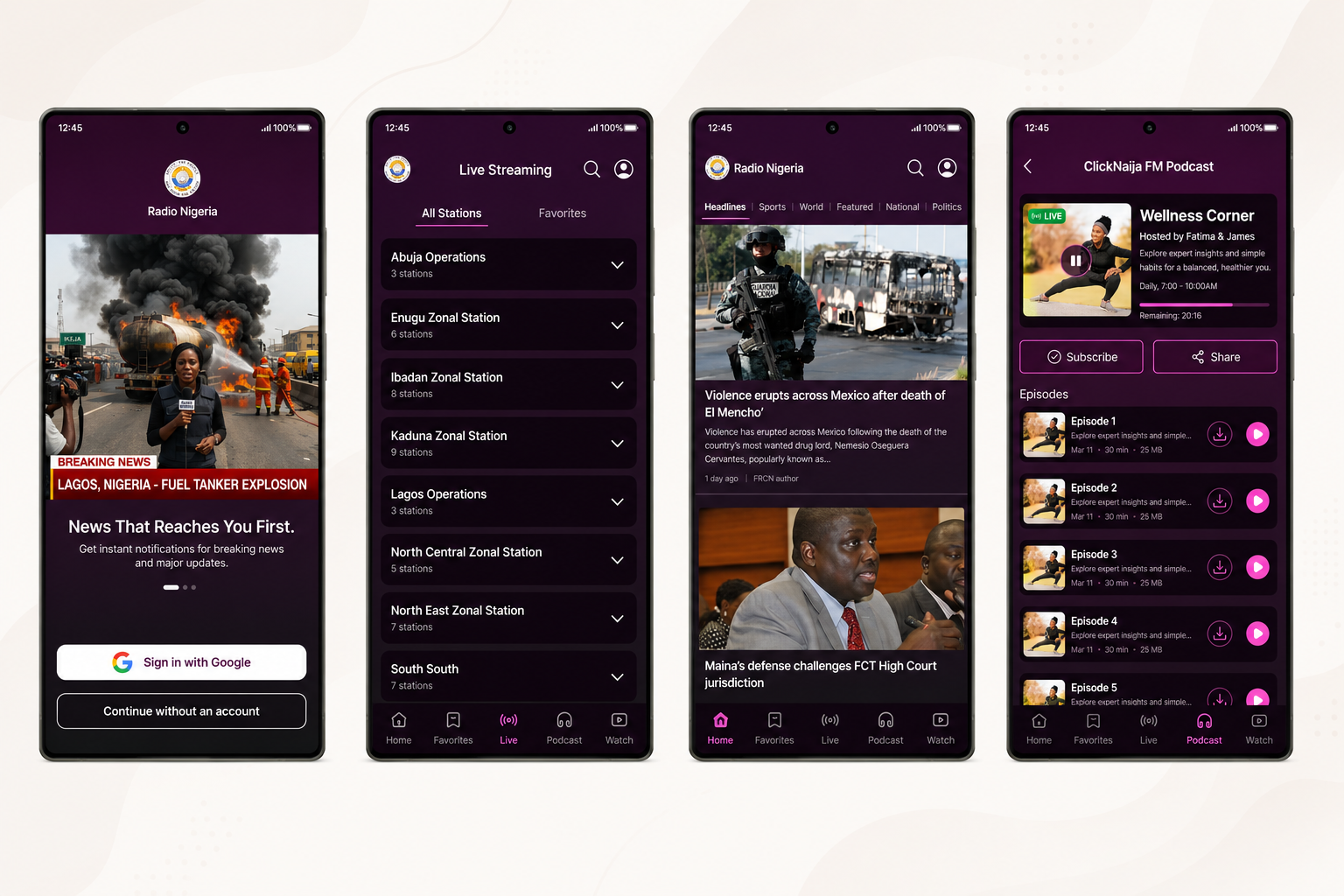
Live streaming: the foundation
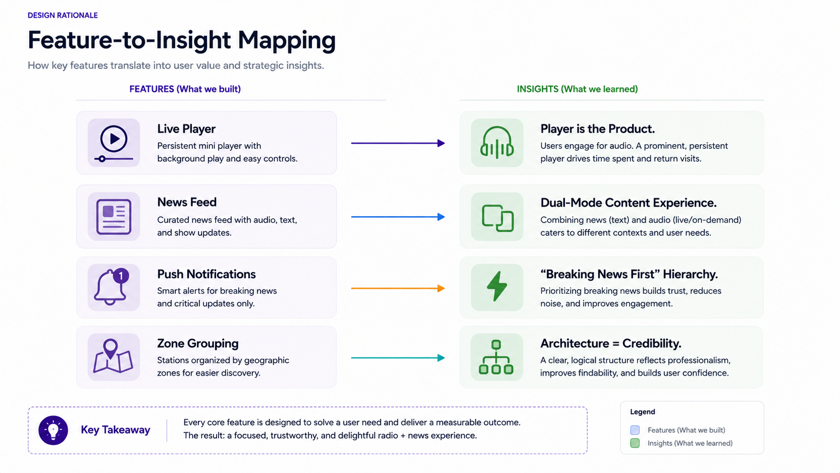
37+ FRCN stations, all streaming live. The player persists as a mini-bar at the bottom of every screen, borrowed from the BBC Sounds pattern. Tapping expands to full player with waveform visualisation, station info, and one-tap sharing. Background playback works across the entire app and when the phone is locked. This is not a feature. It is the product.
News feed: the second mode
FRCN is not just radio. It is a national news organisation. The news feed gives editorial content a home alongside audio, structured by recency and category. Articles load fast with minimal data usage, because the audience is not always on unlimited broadband.
Push notifications: breaking news only
Borrowed from the CNN hierarchy: push notifications reserved for breaking news only, not marketing or general updates. The older audience is more sensitive to notification fatigue. Every push must earn the interruption. If it is not breaking, it is not a push.
Zone-grouped stations: navigation as identity
Six zone cards on the station discovery screen, each containing its regional stations. A visual map of the network that doubles as wayfinding. This feature did not exist in any third-party Nigerian radio app.
Why I skipped wireframes
FRCN needed this app urgently. The timeline did not accommodate two rounds of low-fi review before high-fidelity work could begin. So I made the same deliberate trade-off as on Moore, but for different reasons.
The trade-off held because:
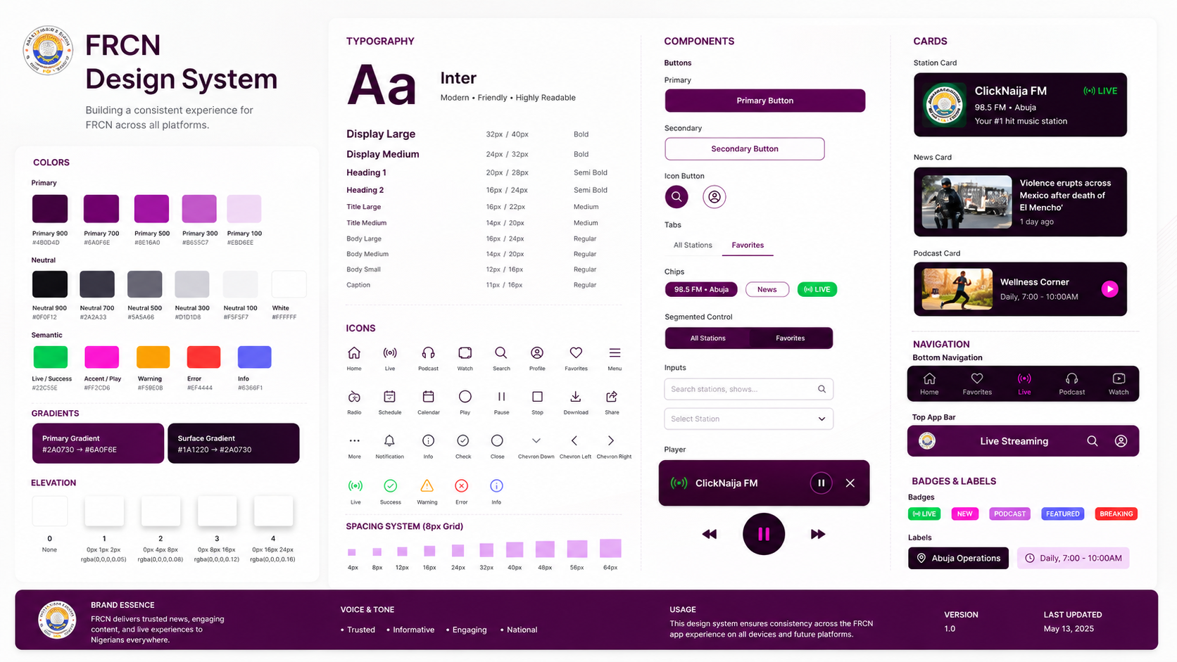
Risk: committing to a visual direction too early. Mitigated by building the design system (colour tokens, type scale, components) before any screens, so structural changes stayed cheap even in high-fidelity.
Key decisions
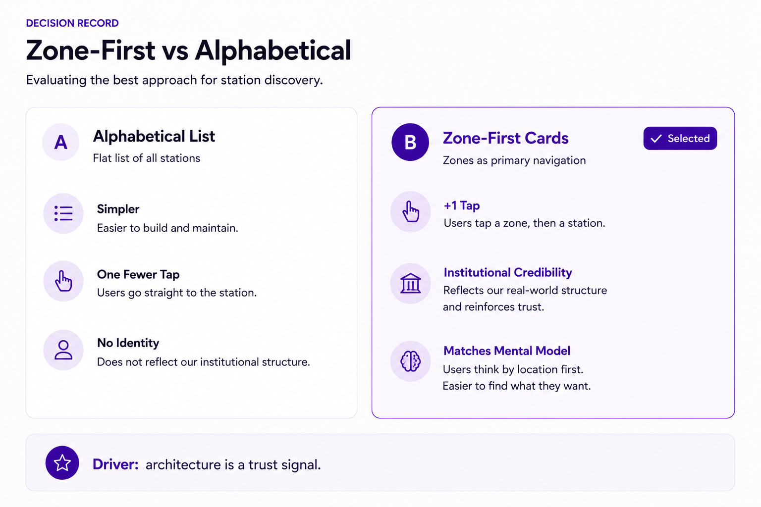
Decision 1: Zone-first, not alphabetical
The simplest station list is alphabetical. Every third-party app did this. But FRCN is not a playlist. It is a national institution with regional identity. An alphabetical list treats Amuludun FM (Ibadan) and Peace FM (Maiduguri) as equivalent items in a flat structure. Grouping by geopolitical zone respects both the network's organisational reality and how listeners actually think about their station.
The trade-off: zone-first adds one tap before playback compared to a flat list. I accepted that because the zone screen doubles as a visual map of FRCN's national reach, with institutional credibility on display every time a user opens the stations tab.
Decision 2: Two modes, one app
FRCN could have shipped a radio-only app and a separate news app. Simpler to build, simpler to scope. I argued against splitting because the audience does not separate the two. To a loyal FRCN listener, radio and news are the same institution. Splitting would fragment the experience and force users to maintain two apps. The dual-mode architecture (radio + news in one shell, connected by a persistent player) served the user and the institution.
Decision 3: Designing for 45+ year-old hands, not 25-year-old habits
Every interaction pattern was pressure-tested against the question: would my parent use this without asking for help? That meant generous touch targets (minimum 48px, often larger), high contrast text on the deep purple background, no swipe-to-reveal gestures (tap only), and clear back navigation on every screen. Accessibility was not a compliance checkbox. It was the design strategy.
Final UI
Deep FRCN purple as the primary surface. White and light purple for cards and content areas. The brand colour carries institutional weight: it says government, broadcaster, serious. The type hierarchy stays compressed (three sizes) to keep every screen readable at arm's length.
For decades, FRCN listeners have tuned in by turning a dial. No login, no account, no barrier between them and their station. Forcing authentication before playback would break that mental model and risk losing the exact audience the app was built for.
The two-path sign-in respects both futures: "Sign in with Google" gives users who want personalisation (saved stations, notification preferences) a frictionless one-tap setup. "Continue without an account" gives everyone else what radio has always given them: immediate access, no questions asked.
The default behaviour is radio. The account is optional infrastructure layered on top, not a gate in front.
Working with engineering
Streaming reliability over visual polish
The first conversation with the dev team was not about colours or layouts. It was about stream reliability. 37 live audio streams on variable Nigerian network connections is a hard engineering problem. I designed the player to handle three states gracefully: connected (playing), buffering (with a clear loading indicator and no ambiguity about whether it is working), and disconnected (with a retry action and a plain-language explanation, not a technical error code). The buffering state was the most important. An older user who sees a spinner with no context will assume the app is broken and leave.
What shipped
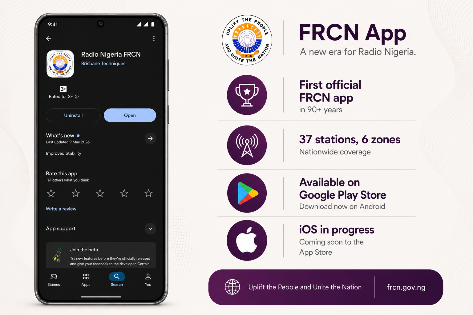
The app launched on Google Play, with iOS in progress. This is the first official mobile app in FRCN's 90+ year history.
For a public institution that has broadcast for nine decades without a mobile presence, this was not a product launch. It was a platform transition. The fact that it shipped at all, on an urgent timeline, with a lean team, is itself an outcome worth noting.
Reflection
This project taught me something different from Moore. Moore was about engagement and emotional design for young users. FRCN was about trust, reliability, and institutional respect for an older audience. The design muscles are different: restraint over delight, structure over surprise, clarity over cleverness.
If I had more time, I would have pushed for two things:
Given the same constraints, I would make the same call on wireframes: the benchmarks were strong enough and the content structure was known.
Next Project